MEET UP
Der Medieninformatik
Process Highlights
Meet-Up Website
Introducing the result of my bachelor project at the university of Lübeck.
A dynamic website that celebrates the Media Computer Science Meet-Up from my university.
The Meet-Up has been around for 10 years now - and during this time many innovative ideas and exciting projects have emerged. To ensure that all these EMI projects and the best qualification theses are not forgotten, we have bundled them and presented them clearly on the new website.
You can discover the modern website and get a structured insight into the history of the Meet-Up.
Here on my portfolio site you will get an detailed inside view behind the creation process and many other informations regarding this Meet-Up website.
Human-centered design process
GenZ as Target audience
The human-centered design process is at the heart of the website development and is here aimed at the Generation Z target group. Generation Z includes those born between 1997 and 2015 and is the first generation to become familiar with the diverse possibilities of the digital world at a young age. This generation is characterized by a high affinity for technology and a deep understanding of the digital world, which shapes their everyday life in many areas. Generation Z is not only one of the most technologically savvy groups, but also one of the most multitasking-capable, as they are used to using several digital channels at the same time. For this generation, technology should above all be seamless and usable. They prefer simple, naturally operable user interfaces that enable quick and uncomplicated use
Accessibility
The focus of the website design is a human-centered approach that takes all user groups, including people with disabilities, into account. In order to provide all users with easy access to the platform, the international standards of the WCAG guidelines (Web Content Accessibility Guidelines) are implemented at Level A. These define basic accessibility requirements and promote inclusion. Measures such as high-contrast color schemes, alternative image texts, clear navigation elements and a clear page structure ensure an accessible and user-friendly website that is tailored to the needs of different user groups.
Developing a modern
Design System
In addition to developing the navigation structure, the development of individual design solutions also plays a central role in the design process. A cooperative brainstorming session was carried out to develop various ideas, which were then documented using sketches and wireframes and discussed in the team. Building on this, an interactive prototype was developed iteratively. First, a mobile-first approach was followed. This approach ensured an optimized user experience on mobile devices, which was then expanded to include a desktop version. The font selection and color scheme selection were also made using the co-design methodology. As with the UI design, this participatory approach promotes the active involvement of all those involved in the design process.
Implementation of a
dynamic website
The technical foundation of the website is based on Nuxt.js, a framework for Vue.js, and Tailwind CSS, a modern utility-first CSS framework.
In addition, DaisyUI, a UI component library, is used to integrate ready-made design components. These technologies were chosen to ensure efficient and flexible development that meets both the design and functional requirements of the project.
The chosen technologies also provide a robust foundation for the implementation of the project. Nuxt.js ensures performance and scalability, Tailwind CSS enables flexible design, and DaisyUI accelerates development through ready-made UI components. Together, they enable an efficient, user-friendly and accessible website that meets the needs of the target group and is designed to be future-proof.
Evaluation of
the end product
The evaluation using the UEQ and the Web-CLIC questionnaire as well as the supplementary qualitative survey reveal a very positive user experience overall.
The website meets both the pragmatic requirements (e.g. comprehensibility, efficiency) and the aesthetic expectations (attractiveness, appeal) of the primary target group, Generation Z, to a high degree.
These findings indicate a successful balance between functional and emotional-aesthetic quality, but also point to potential for further design accents. In view of the limitations (e.g. small sample size, bias due to a tech-savvy environment and self-selection), the generalizability of the results is limited.
Nevertheless, the results provide constructive approaches for optimization, such as the integration of additional visual elements.
Overview
Bachelor Project
As part of my last semester, this Bachelor project served as a practical group assignment within the Media Informatics curriculum.
The goal: to plan, design, and implement a digital product based on real-world constraints. Unlike the written thesis, this module focused entirely on collaborative work, applied design, and technical realization. It allowed students to bring together their accumulated skills and create a tangible, portfolio-ready result.

Project Management & Workflow
The project was developed collaboratively in a small team of 5 students using a structured, agile workflow.
Tasks were distributed based on individual strengths, with at least weekly check-ins ensuring consistent progress. Git was used for version control and collaboration, enabling parallel development and clean code integration.
Clear role definitions, milestone planning, and open communication helped keep the project on track — from first concept drafts to final deployment.
10 years. One site.
Ideas made visible.
Design meets memory.
Beyond the Screen
Content & Storytelling
Creating a compelling narrative required more than just collecting data. The content was gathered from old, often hidden websites and a variety of archived materials. This lengthy process ensured a comprehensive overview.
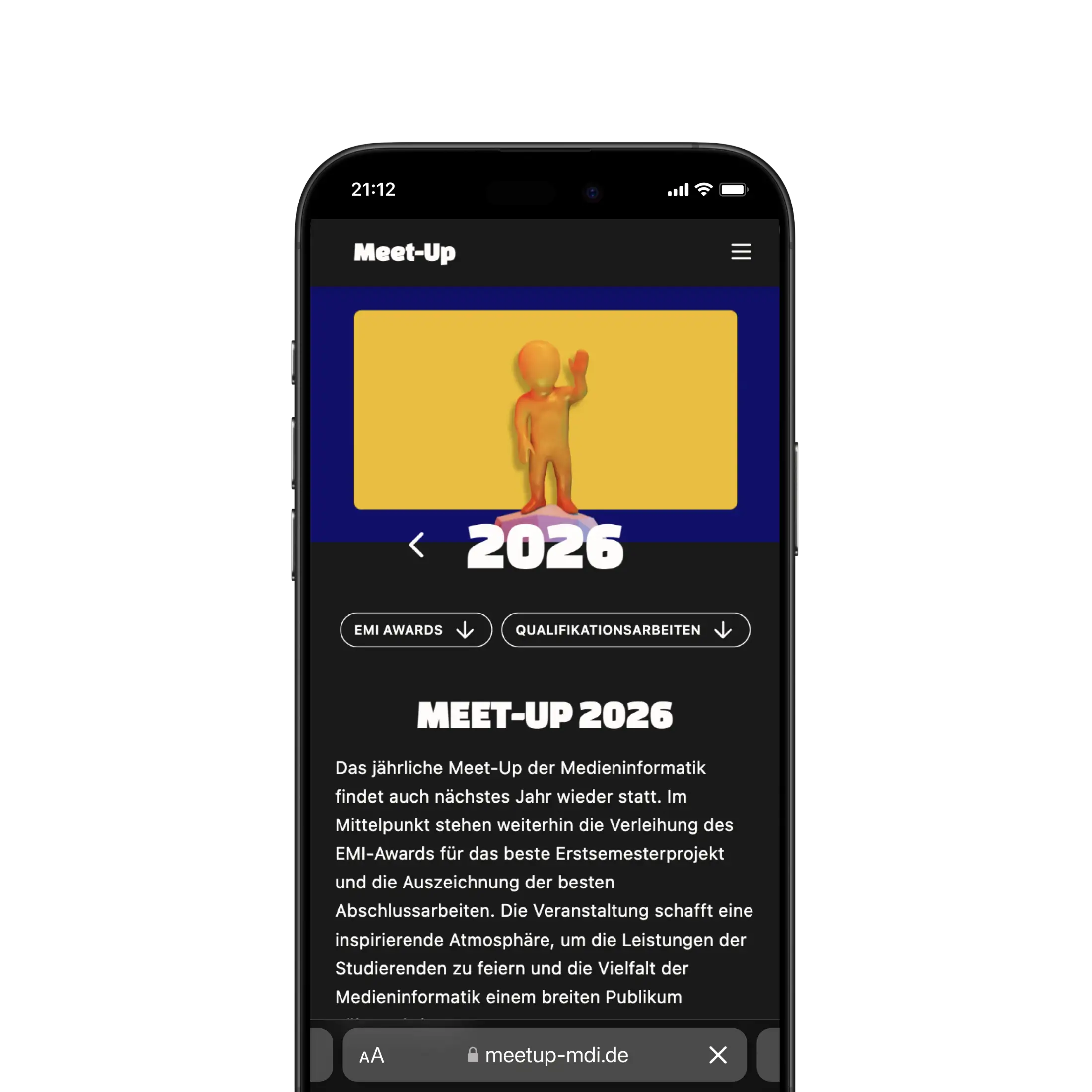
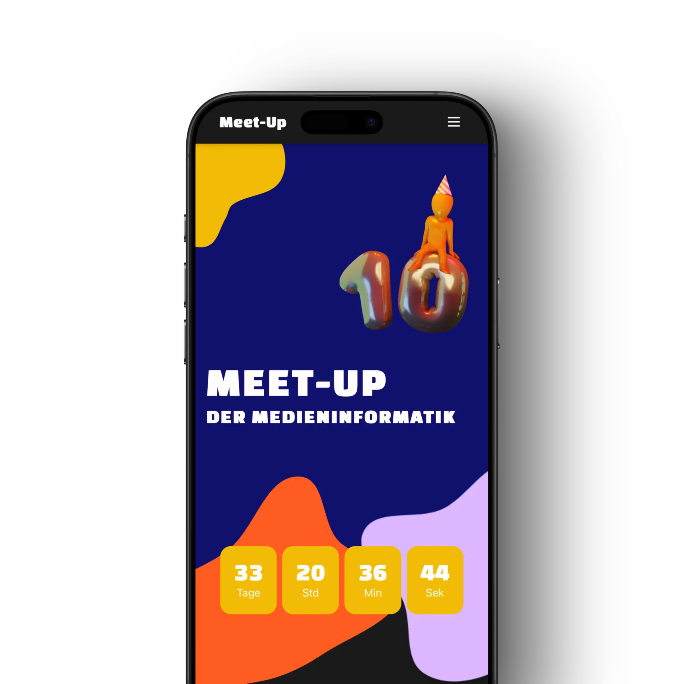
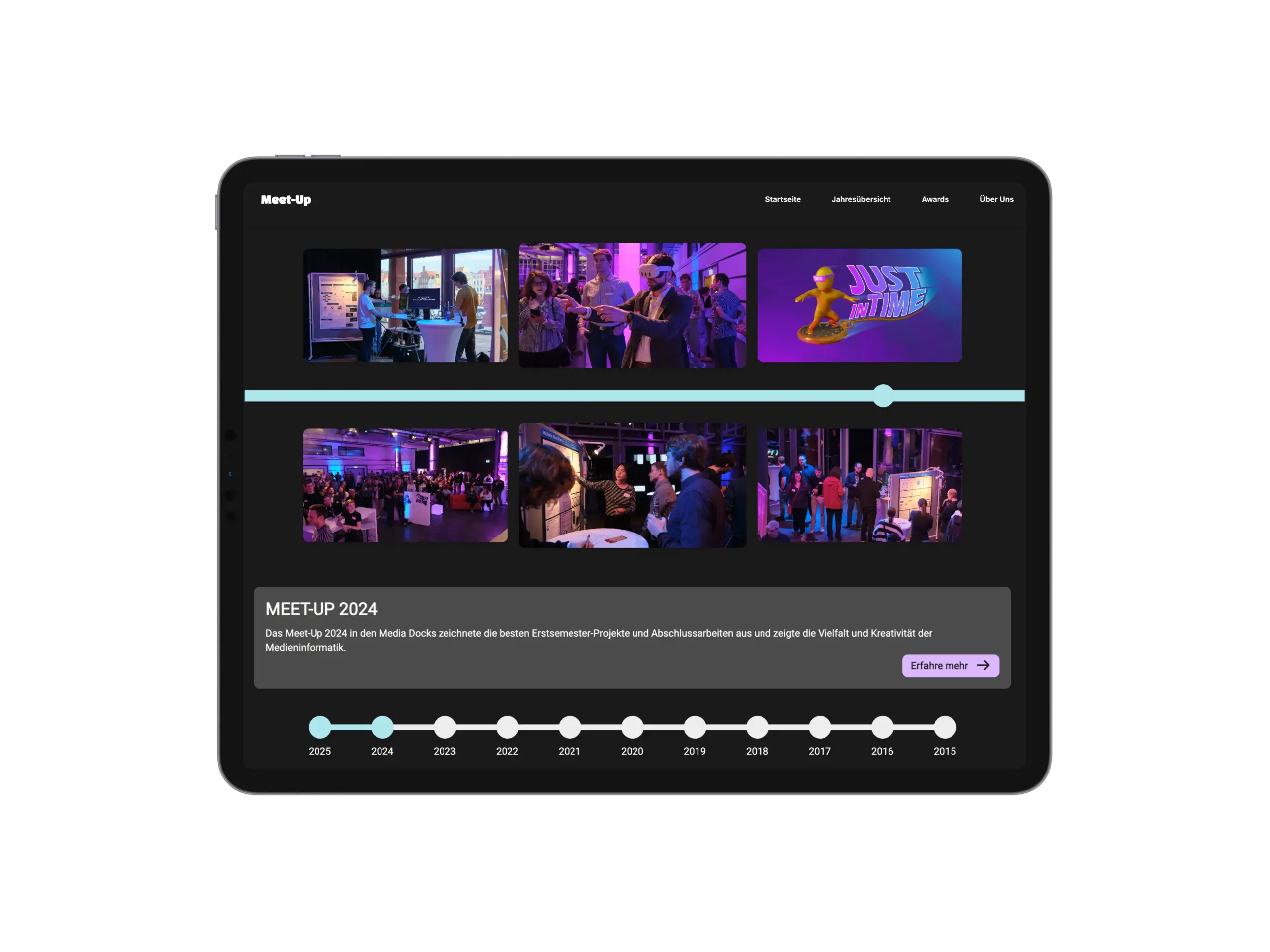
A timeline structures the journey, enriched with impression photos and project highlights. An award podium emphasizes top projects, while a carousel system allows visitors to explore all entries interactively — combining storytelling with intuitive navigation.

Future Development & Maintenance
The site is designed for full scalability through a modular, file-based architecture.
It's sourced from consistently structured Markdown files, allowing new content to be added without touching the core code.
This dynamic setup enables fast updates, consistent data handling, and long-term maintainability. The architecture is clean, extensible, and easy to work with for future developers.

Personal Insights & Learnings
As a collaborative project, this experience provided valuable insights into both individual growth and teamwork.
Exploring frameworks like Nuxt and Tailwind together helped deepen my collective understanding of modern web development. Building a dynamic content system emphasized the importance of scalability and maintainability in real-world applications.
On a personal level, the project sharpened skills in structuring information, curating content, and maintaining design consistency. It also highlighted the value of clear communication, iterative collaboration, and attention to detail — all essential for turning complex data into an engaging user experience.
Presentation
Event and Pitch
The final step of the project was the presentation at the Media Docks in Lübeck.
Here the project was presented in the form of a booth, where the audience was given a detailed insight into the working process.
A scientific poster was created and the project leaders were available for questions and discussions throughout the evening.
In addition, an online survey was conducted at the booth to evaluate the project.
A second poster was created for marketing purposes, and a Snapchat filter was created to target the GenZ.
Snapchat AR Filters
We created interactive Snapchat AR filters using Lens Studio. Featuring Meet-Up branding, the filter enhanced engagement and allowed users to share personalized content. The second filter let visitors choose their own winner, boosting event interaction.